Photo: Luis Quintero
Should buying a ticket really be this hard?
Buying tickets online is something people do every day, for thousands of events, on millions of websites, all around the world. But, as Kathryn Mason writes, it’s not always plain sailing.
Selling tickets is crucial for cultural organisations to generate revenue. Considering how business critical the website is for doing this job, it’s surprising how many people report feeling frustrated by poor experiences that can leave them irritated enough to abandon their ticket buying journey altogether.
Addressing and resolving these frustrations by providing a quick, simple and user-friendly ticket buying experience is vital to the financial success of arts and cultural organisations. At Substrakt, we’ve spent a lot of time working with organisations and speaking to users with different needs to understand the things they like and dislike about the online ticket buying process.
As we’ve written before, being user-centred is central to any successful digital project, it underpins the understanding and development of your audiences.
Below are the most common frustrations we’ve heard and observed about the online ticket buying process, together with some potential solutions and improvements. These have fed into the development of our new ‘purchase pathway product’ which we hope will be useful for anyone looking to improve their e-commerce offer.
User scenarios
Frustration 1: seat selection
“I’d like to choose a seat that’s going to be best suited to my needs and preferences. But the majority of seat selection tools I’ve come across are fiddly and difficult to use – especially on mobile where the screen size is smaller than other devices so I’m unable to properly navigate the auditorium seat map. The colour coding is also frequently unclear and often seems to prioritise using brand colours (or other colours that don’t seem to have any meaning) rather than having considered choices that help me to quickly understand what each relates to and can also work for colour blind users like my dad.
I’d also like to know where the stage and doors are and what the view from my seat is going to look like. But this option isn’t always available, which can be particularly frustrating when I’m told my selected seat has a ‘restricted view’ but fails to show me what that actually looks like. What’s even more frustrating is if I’m not told about the restricted view until I’m about to check out”.
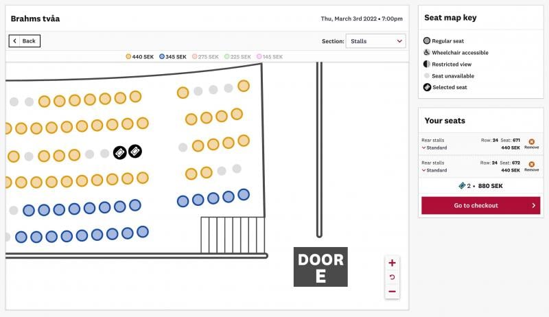
Seat selection is one of the most common user frustrations we’ve encountered, but it’s also one of the trickiest to resolve. A ‘select your own seat’ (SYOS) tool is a complex piece of functionality to build into the process, because it needs to present a wide range of information that lets people choose a seat – as effectively on mobile and tablet as on desktop.
Here’s how we advise organisations to create a quick, user-friendly seat selection process.
- Ensure accessible colours for the seat map, researching and testing with colour blind users. Don’t choose brand colours unless you’re sure that they conform to accessibility standards.
- Ensure your interface works across all screen sizes. By building, designing and testing the seat map on a mobile device, we’ve created an experience that isn’t limited to visual or mouse/trackpad-based browsing.
- Clearly show the stage, doors and stairs on the auditorium map.
- Test, test, test. We test Viadukt prototypes at every stage of build and design to gather and address feedback from users across a range of access needs. This work is never complete and we continue to keep it in mind as we develop the product further. But testing as often as you can, with as many people as you can, will always stand you in good stead in terms of improving accessibility.

Viadukt’s select-your-own-seat screen
Frustration 2: add-ons
“Why is it taking so long for me to get to the checkout page? I seem to be getting messages left, right and centre asking me if I’d like to add all these different things to my basket when I just want to buy my tickets. I may well want to have some food or an interval drink, or to buy the programme, but given the show is 6 months away I don’t want to make those decisions yet. And to be honest, the non-stop upselling has put me off even considering some of the other things being thrown my way, like membership or donation options”.
Cross-selling has become common in the arts and culture sector, with audiences being prompted to add other things to their basket. But that’s not the issue. The issue is when it feels irrelevant at the time of buying – such as booking a pre-show meal months in advance.
Such irrelevant cross-selling prolongs the checkout process and can lead to an erosion of confidence in the whole site, counterproductively resulting in the buyer skipping to the end of the process.
So, important considerations include:
- What’s relevant at the point of sale and what add-ons could you defer until closer to the booking date (in a reminder email)? A recent Baymard Institute study showed that 52% of cross-sells were completely irrelevant or based only on what other customers bought.
- Allow for the direct sale of add-ons. Food and drink or merchandise could be available any time, not just tied to a specific booking date.
Frustration 3: logins and passwords
“I’ve been trying to log in to my account and my password isn’t working. I’ve clicked ‘forgotten password’ even though I’m sure if I had one it would be the same one I use for other accounts (which is making me question whether I actually have an account with this venue?!) I’ve now been sent an email inviting me to reset my password, but the minimum password requirements are so specific it’s no surprise that I’ve probably created an unusual one that I’ve since forgotten. Why can’t they just tell me whether I’ve already registered, otherwise this reset password malarky is a total waste of time and the countdown timer in my basket is almost up so I’m going to lose my tickets!”
Based on our user research, we’ve identified ways to reduce friction throughout the login process by using clear and consistent messaging. Getting this right can help cultural organisations increase ticket sales, reduce calls to the box office and improve customer satisfaction. Here’s what we suggest:
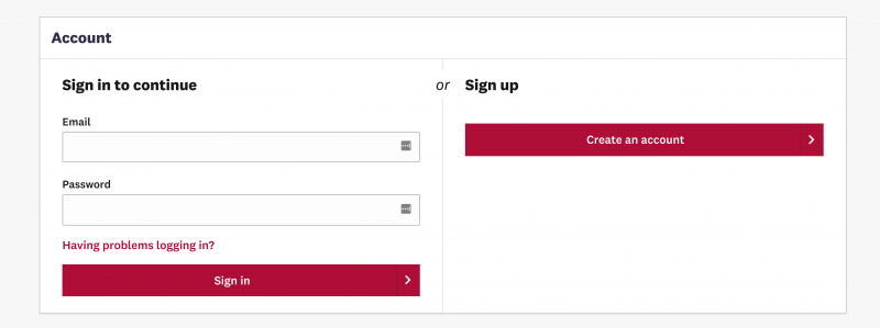
- Ensure the landing page sets out options clearly – ‘sign in’ or ‘sign up’. Using good design and layout will clarify for the customer that there’s a choice to be made.
- Do not add to customer frustrations by blaming them for login difficulties. Think carefully about your messaging around forgotten/incorrect passwords. ‘Having problems logging in?’ as opposed to ‘Forgotten your password?’ helps to position the problem as one not created by the user.

- If the customer is ‘Having problems’, you can give them a message to: ‘Enter your email address and we’ll email you a link so that you can log in. You’ll be able to change your password if you need to’. They won’t have to set a new password. If their address is already registered, they can simply click a link and be automatically logged in. If they don’t have an account, they won’t receive an email.
Frustration 4: information
“Great, so I’ve booked my tickets but there doesn’t seem to be much information about the venue or performance anywhere. Simple information like running time, whether there’s an interval (and how long it is), what facilities and amenities are available, and nearest transport links would make planning my trip a lot easier. Now I’m going to have to find it all myself.”
Similar to logging in, this is about clear communication. Organisations often assume familiarity with their venue. But many are newcomers (or have only visited once before) and don’t have the basic information they need. It’s important to provide it either at the time of booking, on the confirmation page or in the confirmation and/or pre-visit email. The relevant information will vary between venues, but it’s important to include information on:
- Running times/intervals
- Facilities (including toilets, cafe/restaurant, bar)
- Transport links
- Parking information
- Step free access
- Contact information (access, ticket sales, etc).
- What to bring (ID for student/elder tickets, e-tickets or printouts, masks, proof of vaccination)
- Other local information
Putting your audiences centre stage
Whichever system you choose, it’s always best practice to be user focused when thinking about e-commerce. This approach has helped us to learn about other specific features users would find helpful, which we’ve also built into Viadukt. This includes other features such as the ability to filter by price and date, and to share individual tickets in a group booking.
While we haven’t addressed accessibility specifically in this article (it warrants one of its own – coming soon), being user centred will bring you closer to offering a good accessible digital experience. Accessibility and usability are nearly synonymous concepts – by making your digital experiences more accessible, you’ll automatically be making it more usable for everyone.
While budgets and timelines can hinder organisations’ ability to completely redesign their purchase path, there are enhancements that can be made relatively simply with significant impact. Start by auditing the overall experience, speaking with users and identifying the areas for improvement. Once you know the friction points you can start to resolve them.
As long as your audience is centre stage in your thinking and planning, you’ll be closer to offering a user-friendly experience, selling more tickets to happier audiences.
Kathryn Mason is Marketing & Communications Manager at Substrakt.
This article is part of a series contributed by Substrakt exploring the many ways in which arts and cultural organisations can embrace the world of digital.
Join the Discussion
You must be logged in to post a comment.