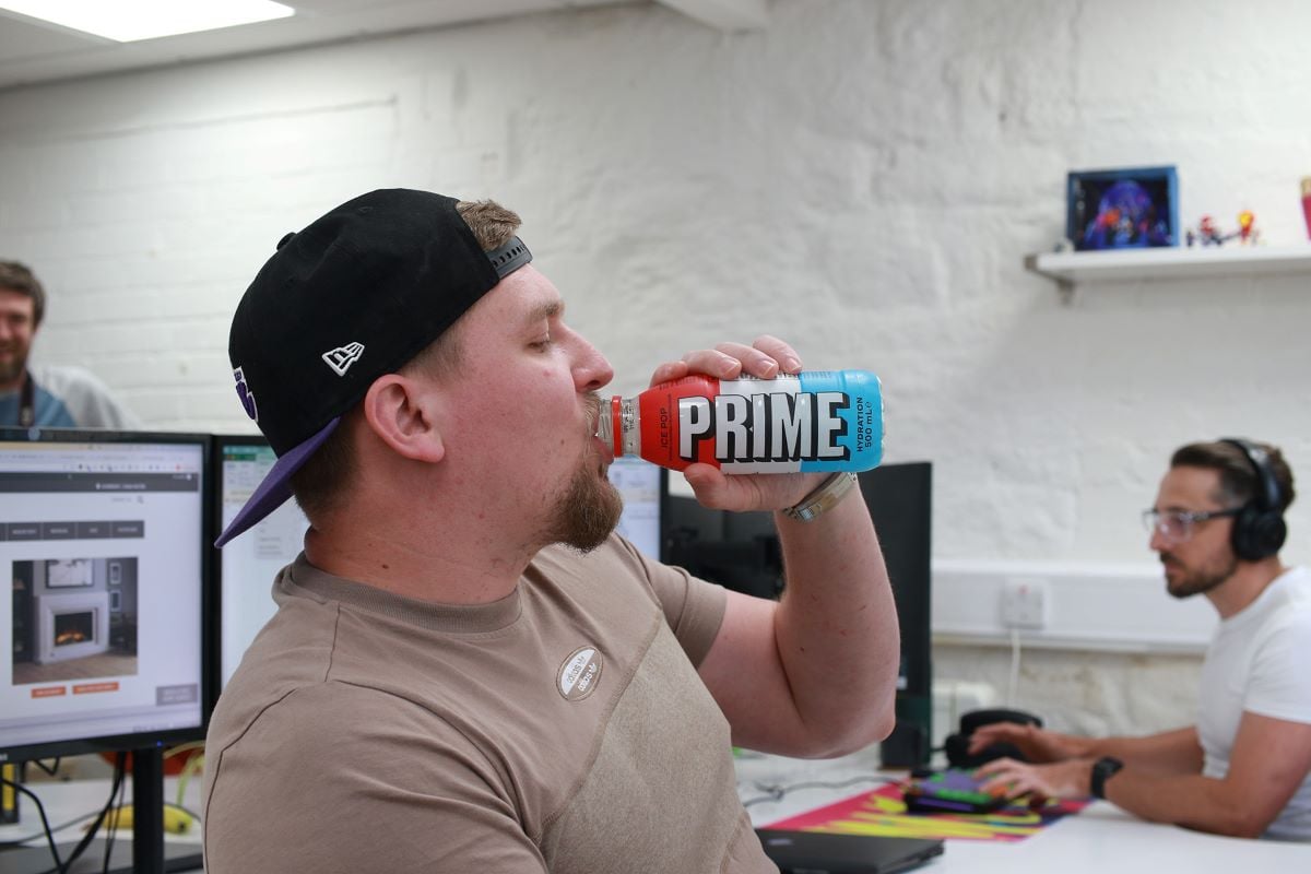
Is Prime as prime as its name claims? Who can say…
Photo: Rob Marshall
‘Apple doesn’t sell fruit’
What’s in a name? And how does an organisation go about changing its brand identity? Lauren James has some top tips.
Like most of us of a certain age, I learned everything I know about marketing from watching Mad Men. It’s not always helpful. “Get me 20 tags by lunchtime!” I say to my content team, and they look at me blankly. And the design team hate it when I lock them in cupboards to work on pitches in secret.
But there really are times when you need to change your name. When you merge with a rival, for example, or if your dog food brand gets caught up in a horsemeat scandal. Escaping the draft is also a legitimate reason, if not strictly legal.
The name of an organisation is a strange thing. It’s just a name – a combination of words. It might have been picked at random or morphed over decades – even centuries – to become what it is today. But when we use it every day, and see it emblazoned on shirts and pens and building facades, we get attached.
When we do decide to change it, that’s a big step. So I’ve pulled together some advice that hopefully will help you manage the whole process.
What do the experts say?
First, I asked two of Splitpixel’s brand designers, Sam and Rob, for their thoughts on rebrands that involve a new name. Sam thinks the name is the hardest part of any rebrand because it’s more subjective than any other element of the brand, thanks to the emotional weight it can carry.
By developing a visual concept well enough, you can bring people around to seeing your intentions – but a name needs to grab you immediately. It can be a demoralising process.
Rob is more optimistic. Sure, it’s the hardest part, but it also has the potential to be the most rewarding. Get it right – come up with something that fits the organisation perfectly, that transcends a literal meaning to encapsulate something deeper – and you’re onto something really special.
Why you should – or shouldn’t – change
You should change your name if it no longer represents you, and even more so if it actively misrepresents you. If you cringe at the sound. If it’s holding you back.
But you must weigh these impulses against the equity it has – the recognition and reputation, and particularly the search performance. But if it needs to change… well, it needs to change.
What makes a good name?
As a writer, my answer will always involve puns. I long to start a punk-themed restaurant on a boat called Meat-Free by the River’s Edge. But more seriously, my brand designers say it should be:
• Memorable – or at the very least, not boring.
• Unique – check if someone else is using it.
• Easy to read and say – make sure you feel comfortable saying it out loud, and you don’t stumble over the words.
• If you use several words, ensure the initials work together. I worked for a company with the initials SM&MS, I would stumble every time I answered the phone: Essemmanmersers. Essemmess.
• Also – I can’t stress enough – make sure the initials don’t carry connotations: Krusty Komedy Klassic style.
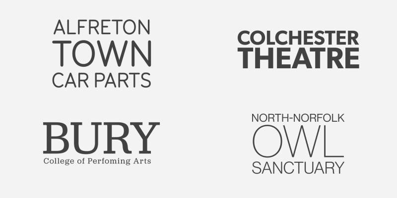
• Pay attention to word length. If one is much longer than another, it may look unbalanced in certain layouts and could lead to a less important word being more prominent in the design.
 It’s a cracking owl sanctuary, yes – but the weighting feels off… (Image:Rob Marshall)
But should a name be descriptive? The answer from our experts was a delightfully vague “not necessarily”. It’s one of the most difficult preconceived notions in branding to break – that the name or logo should describe what you do exactly. The answer to that is usually “Apple don’t sell fruit”.
How to come up with a new name
There’s no foolproof process. Sometimes the right name just hits like a bolt from the blue. But when trying out new options, we tend to do the following:
• Research the organisation. Pick out interesting and unique words specific to them: their service, their industry, their values, their aesthetic. Although the name doesn’t have to directly describe these to work, it’s the best place to start.
• Look for a story – something that captures the spirit of what the organisation wants to achieve. If it includes words from stage one, all the better, but it should inspire, not restrict.
• Think of the first stages of the visual identity that accompanies the name and use colour, typography or an initial logo design to sell it.
Beyond that, there’s no secret. Just rinse and repeat until something fits right.
What about our name?
I should emphasise that no one with any branding expertise picked the name Splitpixel. Our directors pulled the two words out of different hats in 2008 and now we’re stuck with it.
If we have any gripes with it, it’s that people often format it as SplitPixel or Split Pixel. We’ve tried to address this with typography; our most recent brand refresh restyling our logo from SPLITPIXEL in caps to splitpixel in lower case with the hope of making clearer that it’s all one word.
 Just a soft touch, but I think it works… (Image: Rob Marshall)
But, no, we’d never think of changing it. We’ve only started to get name recognition in the last few years in the sectors we want to work with. As SEO specialists, our Head of Marketing would go on a rampage if we even considered throwing away all that tasty link juice around our name and domain.
It may be a little bit dated. In decades past, sticking a tech-sounding word like ‘pixel’ in your name was the trend, but it’s transcended that initial meaning. It makes sense to people, even if they don’t know why.
We haven’t tried to come up with any atom-splitting analogies or anything to justify it. What does Splitpixel mean? It means us. We just… are. And I think that’s a good place to be.
Lauren James is Head of Content and Web Projects at Splitpixel.
![]() https://www.splitpixel.co.uk/
https://www.splitpixel.co.uk/
![]() @splitpixel
@splitpixel
This article is part of a series contributed by Splitpixel to share expertise on how to best apply accessibility and inclusivity principles in digital spaces.
Join the Discussion
You must be logged in to post a comment.